In the world of motorsport, particularly Formula 1, performance is measured in milliseconds. A single tenth of a second — 0.1s — can mean the difference between starting at the front of the grid or being buried in the midfield. During qualifying sessions, it’s not uncommon to see several drivers separated by just hundredths or even thousandths of a second. For most of us, that kind of precision is difficult to grasp without some form of visual aid.
This raises a fascinating challenge in data communication: how do we effectively visualize and convey the significance of extremely small time differences? When we read “0.010s” on a timing sheet, our brains often don’t intuitively process how short that really is, let alone what it means in the physical world. Numbers alone can be abstract, especially when they lie outside of our everyday experience of time — like blinking, reacting, or moving.
Depending on the context, time can stretch or compress dramatically in our minds. A one-second delay in loading a website can feel irritatingly long. But in high-speed sports or scientific experiments, even a single millisecond is packed with meaning and consequence.
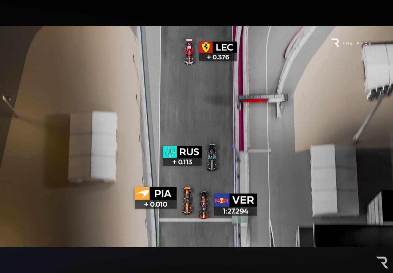
A real-world example from Formula 1 helps bring this challenge into focus. The image above captures a qualifying session where several cars were separated by gaps so small they’re almost imperceptible in real time. Yet, those microscopic differences were enough to reshuffle the entire starting grid. And interestingly, once visualised, those tiny time gaps don’t seem quite so tiny after all — they reveal a surprising sense of scale.